
Just started your web development journey?? And struggling with media queries ??
Well you are at the right place. This is a small guide about media query.
As a beginner we struggle with lot of things, wheather it be the CSS box model or media query. If you're new to responsive web design, media queries is one of the first and also the most important CSS feature to learn. One popular CSS strategy is to write mobile styles first and build on top of them with more complex, desktop specific styles. Doing this will make the website load faster on mobile divices.
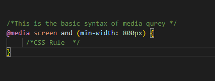
To make our websites response we use the @media rule. It uses the "@media" rule to include a block of CSS properties only if a certain condition is true. The @media rule is used to define different style rules for different media types or devices.
The @media rule was first introduced in CSS2, unfortunately it wasn't supported by a lot of devices. The only devices that were supported were print media type.
Media queries was introduced in CSS3. It extends the media types idea. Instead of the type of the device, this looks at the capability of the device. It can detect the environment on which the site is running i.e wheather the user is using a mouse or a touchscreen.
It is convention to either add all the media queries at the bottom of the css file or add the media query beneath the related CSS style. This way of adding media queries is more commonly used for writing CSS with preprocessors such Sass or Less.
We can also write our media queries in a seperate style sheet and then load them into the main CSS file. Insted of using @media rule, this media will use the @import rule to list the file name, media type, media feature. Another option is to load the style sheet into the html file with the link tag and a media attribute. The media type and feature is added as the media value.